installation view
The Narrows, Melbourne
Image courtesy of The Jazzinstitut Darmstadt and The Narrows
Photo credit: Warren Taylor
As a retrospective, Kusama — showing currently at the Tate Modern — satisfies the standard requirements for historical span and conceptual consistency across material and spatial frameworks. However, these paintings, sculptures and installations seem so directly transmitted from the artist, it’s difficult to assess what kind of dialogue they’ve participated in over the decades. Stepping through an antechamber to arrive at the show’s only video work (Self-Obliteration 1968), one passes several display cases of vitrine porn — a choice display of invitations and catalogues tracing the artist’s career. The contrast between the unbounded sprawl of the previous rooms and the forensic clarity of this work’s associated archive is stark. Despite its ancillary nature, this material offers a clearer definition of the work’s position and context; tempered by the design of its moment, Kusama’s work is sensed as a socially integrated endeavour rather than a projection of the artist’s subjectivity. These documents indicate that her image of controlled chaos (happenings, etc.), in conjunction with the singularity and repetitive application of her motif, connected her critically with Minimalism and the New York avant-garde scene from the late 1950s onwards.
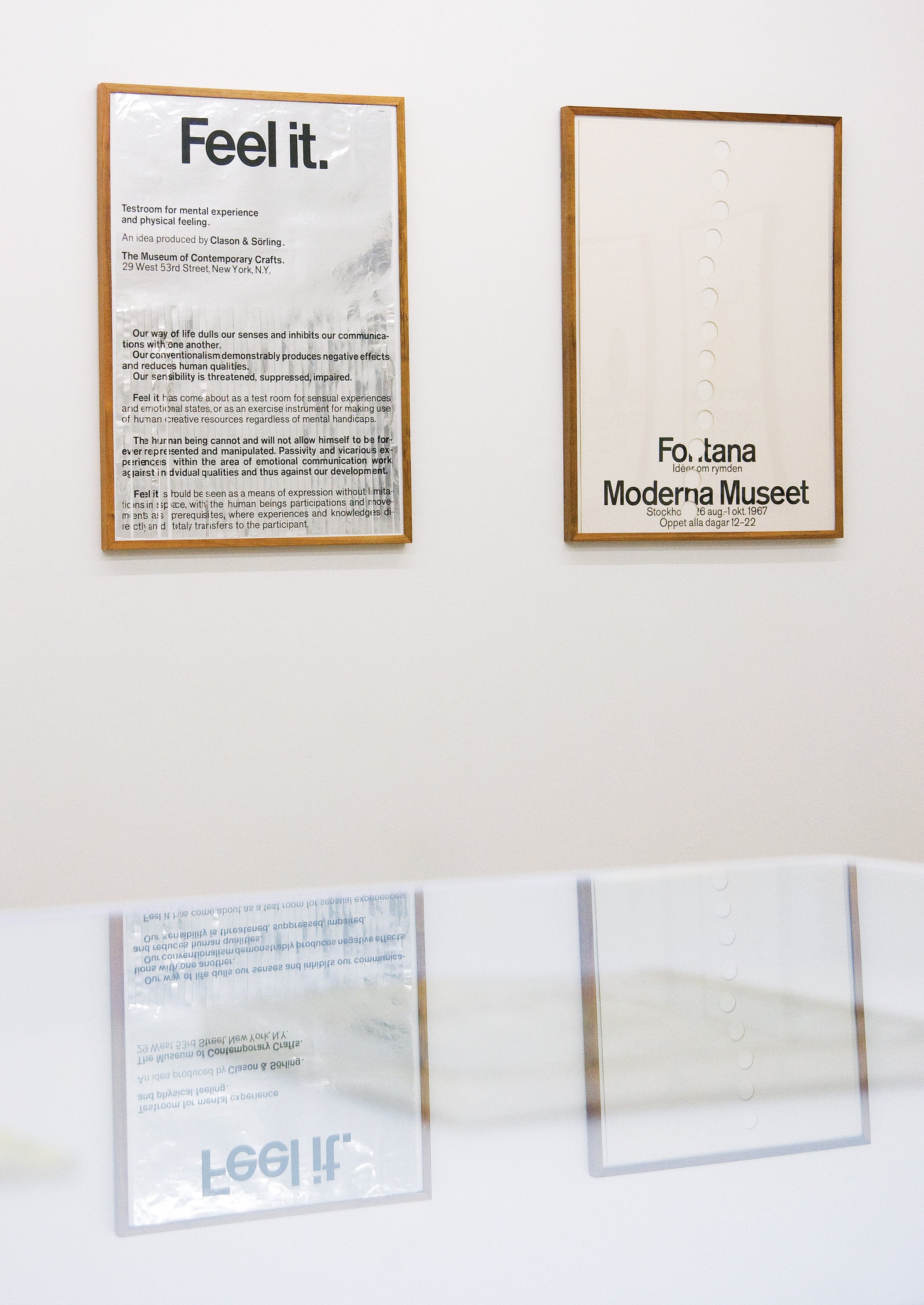
After the fact of art, this type of material continues to represent, not only as evidence, but also as a point of connectivity with a ‘scene’, a record of how art moves through the sphere of communication; how its visuality is framed, via design, by the tools of public interface. Outside of its function, these publications, announcements and correspondence present one language at face value while simultaneously describing another — a visible and tactile record of design’s relation to art and its influence on the way it becomes socially mobilised.
A similar attitude to the presentation of print graphics as a potential site for critical shaping helped define The Narrows’ international profile as one of the few spaces dedicated to exhibiting print design in both archive and project form. Active as a physical space in Flinders Lane, Melbourne between 2006 and 2010, and currently existing as a floating curatorial program and publishing project, The Narrows points to the complexity of contemporary gallery typology. While an ‘artist-run vs commercial gallery vs museum’ framework has never been satisfactory or accurate, this project has managed to further complicate the range of definitions we can use to describe such an endeavour. Simultaneously operating within and for a community with no confusion or lack of clarity, The Narrows is a private gallery showing art and design but not necessarily in the same show, with an evolving curatorial program, motivated by an interest in collection and research.
During its time as a gallery space, a broad program swung from the under-appreciated archives of graphic designers Rogério Duarte and John Melin, to Bianca Hester’s architectural occupation and Masato Takasaka’s conjunction of Prog-Rock’s ornate virtuosity and post-colour-field sculptural improv. Categorically, this program could be described as comprising: design exhibited as art, art which negotiates design, and, simply, art. In a thematically motivated project, however, a kind of framing occurs and establishes a sense of coherence through proximity and shared context. The Narrows’ methodology can be mapped through director Warren Taylor’s overriding interest in print media as artefact and communicative system, and how art moves within and around it, in a mutually interactive arrangement across historical, physical and digital platforms. In addition to the stark parameters of the gallery space and website, continuity across the program was reinforced by The Narrows’ posters. Designed by Taylor for each exhibition, these collectible editions performed multiple roles — announcement, invitation, catalogue text and, most significantly, as an associated document which, often in collaboration with the exhibitors, responds to the work and effects its dispersal towards a discursive model. Taylor speaks of ‘designers never really making their own work but having a voice or participatory gesture’ within the formatting and presentation of ideas; as such, the ‘design’ speaks through and with the language of the artist, and conversely, the art is presented and contextualised through the principles of design.
This relationship, less problematic and altogether more inclusive and integrated in recent times, still generates ambivalence regarding what kind of meaning can be evoked when art and design employ each other’s methods and signifiers. In the increasingly diluted culture industry, art and design use each other as tools, as products of relational awareness, visual erudition, and the new cosmopolitan connoisseurship of expanded aesthetics; art and design culture, along with food and fashion cultures and generic political posturing, contribute to the construction of the ‘miscellaneous creative’. For designers, benefit can be gained from proximity to art’s perceived profundity and philosophical positioning, whereas for artists the vernacular and formatting of design can provide a veneer of criticality and the appearance of Post-Minimal rigour. But design also offers a convenient sidestep around the problem of earnestness and the pitfalls inherent in subjective display. Design is capable of being a component of language without expression, a discursive unit free of gesture, largely through the way it negotiates time.
Design ‘holds’ time in a different way to art, and is entirely predicated on its own contemporaneity. The moment of its making is recoverable within it — it speaks of its time so decisively that it functions as a pure and direct image — and its relation to this moment is precise and clearly articulated. Even examples of design which revisit a historical period, or reference a past design, are unable to escape the material and technological reality of the time in which they’re made; the tools which bring them into being leave an imprint which can’t be faked. Art, while being more than capable of containing and describing its own time, is full of other things besides, including the potential to complicate its apparent historical position and speak across multiple moments, its social relation, and its subjective motivations.
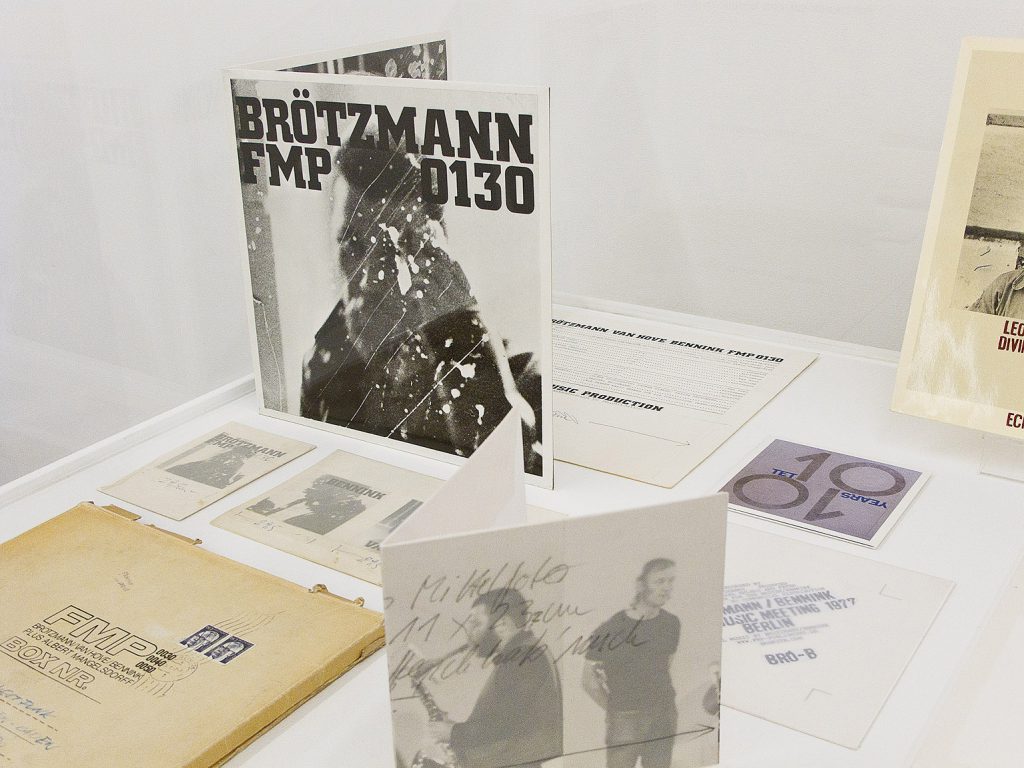
The particularities and restrictions of print design (the necessity for accuracy and communication) don’t preclude it from being ‘full of its own time’, but this quality seems entirely more apparent in late-modern design than it does today; contemporary print design seems so diffuse and ubiquitous that it struggles to affect any particular sense of time. Exhibitions such as Ronald Clyne: Folkways Record Cover Design 1951–1981, curated by John Nixon and Stephen Bram and Graphic Work 1969–2010 (a survey of jazz musician Peter Brötzmann’s parallel design practice, curated by Taylor and Andrew W. Hurley) traced a trajectory back and forth between print design and the event it is in the service of, be it music or visual art. In the case of the Clyne survey (a selection of LP covers designed for Folkways Records) the relationship between music and design was examined, and, as a consequence, this relationship to the work of Nixon and Bram.

Exhibitions such as Ronald Clyne and Graphic Work demonstrate the influence design can have on art’s presentation strategies and its effectiveness as an unencumbered semiotic language. Graphic Work 1969–2010 illustrated the extent to which art or artists can be sensed through related material — posters, album covers, and liner notes. These 'contact relics' — material with a direct connection to the event — are invested with a legitimised proximity or contemporaneousness, they represent the experience, contain it, and establish a dialogue of intimacy with it. In the case of Brötzmann, who designed most of his own visual material, these events are manifold and link together across musical performance, publicity, and visual representation as a singular output machine. This type of integrated involvement which The Narrows promotes, offers the artist an opportunity to produce an associated document, contributing to a larger discourse and scholarship, whilst retaining the artist’s voice. In this context, ‘ephemera’ no longer accurately describes this type of material — rather, it speaks of an investment on behalf of the artist and designer, an intentionality rather than simple announcement or declaration, and is undertaken with an understanding of its circulation amongst peers and professionals alike. This agency locates these documents as a form of currency, continuously active and exchangeable.
Nixon and Bram’s collection and curatorship of Ronald Clyne’s Folkways archive defined a relationship beyond standard fandom and its museo-display: this exhibition formalised the artists’ shared research and their expanded practice of influence and engagement, and as a consequence, articulated a sense of both the breadth and the specificity of what constitutes ‘method’ — the things artists think about and bounce between when they’re putting together or unravelling a practice. This focus has evolved alongside Taylor’s own interests in collecting, music, typography and anti-design — many Narrows projects intersect one or more of these areas and, when considered as a loose thematic sequence, offer a sense of articulating an existing form or sensibility, addressing the archive as a place of production and event. Word Times Poster, Taylor’s ongoing archive documenting the ‘accidental design’ of window announcements in commercial and public spaces, describes functionality in extremis; genuinely ephemeral, these announcements are created as simply and quickly as possible, using default formats at every turn — PC, program, typeface and page size — attempting and achieving nothing beyond immediate and direct communication. However, these examples of anti-design, like design itself, betray their time: since 2007, Microsoft has replaced Times as their default typeface in Word, placing this collection in a defined historical position.

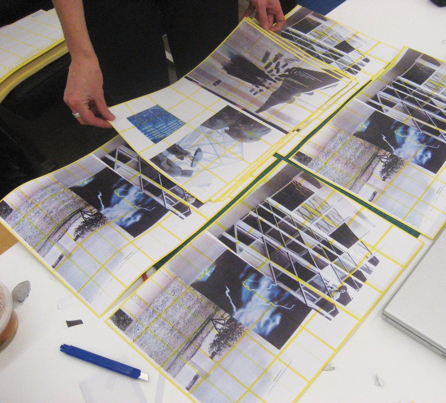
Significantly, in an impoverished arts publishing culture, The Narrows has regularly collaborated with artists, exploring what is possible within restricted funding parameters to offer a publishing and design outcome which sits outside any cohesive design program; often these publications have been generated by the artist presenting a visual concept or research-related thread which develops into book format. Early Narrows projects, such as Printworkshop 2008, a ten-day in-house publishing event during which invited artists designed an artist’s book using a patterned paper stock — designed by artist Matt Hinkley — producing a series of unique collisions between the artists’ extended visual research and an impervious fluorescent yellow grid.
As the acceleration of possibilities for art’s online presence continues, the artist book and similarly dedicated print material accrues significance beyond collectability; assisted by increasing obsolescence and the inevitable slide towards a status as cultish artefact, these objects inevitably function as loaded components of an extended practice, reflecting the importance of the role print material plays in an artist’s research and the establishing of context. This populating of page-space, the pushing of the irregular, provisional and indeterminate qualities of art-making against the rationalised field of publishing, enables artists to be present on the 'other side', to participate critically in the way information about their work is distributed and, ultimately, valued.
Damiano Bertoli is an artist.
